Blizzard Entertainment Corporate Intranet
Vision: Unify the organization under a single point of access
One of the first major challenges I was given as the Senior UX Designer of the corporate applications team was a redesign of the company intranet. At the time, it was powered by Sharepoint 2013 and was quickly losing its status as the entry point into Blizzard's technology landscape. Other platforms had come up around it (Confluence, Jive, ServiceNow) and users were becoming increasingly confused and frustrated at the intranet's role in their day-to-day lives.
My role in this project was lead designer on a cross functional pod. Over the course of 18 months, we set out to deliver a custom-built intranet that was both personal and inclusive, and serve as a single pane of glass into other systems.
The Problem

Blizzard’s ecosystem of tools has become technology-centric and product-oriented. On top of day-to-day, discipline-specific applications, many employees must navigate a litany of other products to perform simple tasks or find information.
Few of these tools talk to each other, and many have overlapping functions and purposes. There is little to no guidance across the business on how to request or use each one. Because teams are often siloed, similar products are often approved and purchased.
Our research
Before one receives a vision, one must go on a vision quest. Our vision quest started by digging deeper. User research activities like card sorting, interviews, user shadowing, and good ol’ analytics revealed additional pain points:
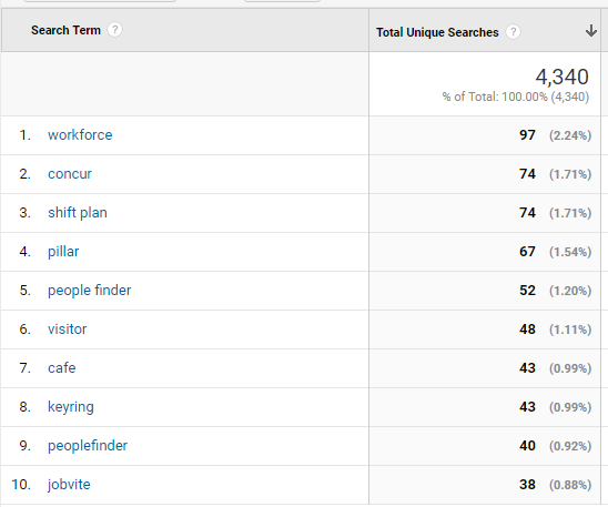
Where is it?
Not being able to find anything. Navigation included a 159 item mega-menu that did not give much consideration to permission levels and access. Less than 40% of the links were used regularly.
Why does search suck?
Search wasn’t effective! The Sharepoint 2013 search engine left a lot to be desired, and it only searched for whatever was on Sharepoint.
Why is this so old?
Lack of content governance. Many links and pages were either no longer relevant or 404'd.
Why is it slow?
Sloooooooooowwww to a crawl for our regional employees. 10+ second load times on some pages.

The Vision

Research gave us our vision. Our goal was not to reduce, but to unify. Instead of resisting each wave of new technology, we would try to embrace it, and let the intranet be a jumping-off point into the rest of the tech landscape.

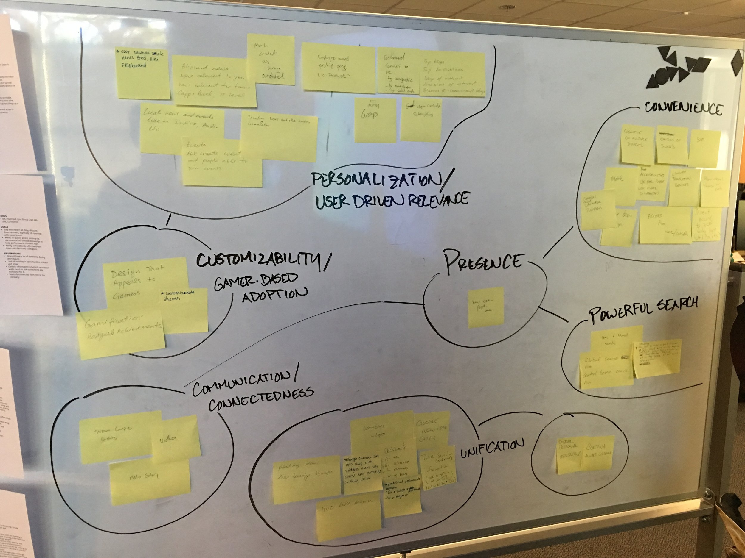
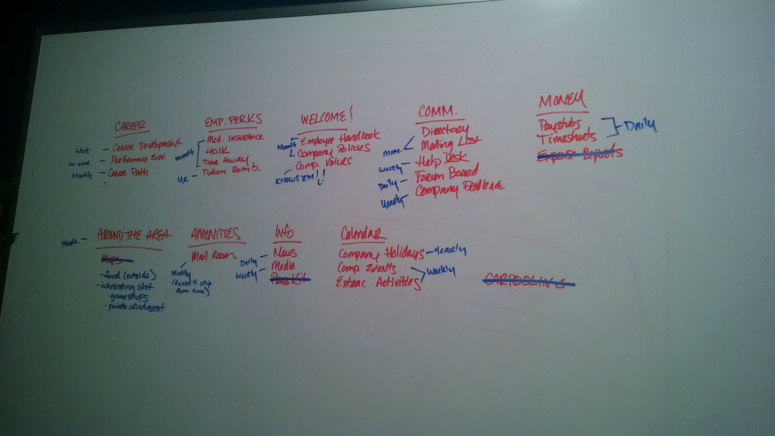
Who are our users?
From our research, we developed four personas to represent Blizzard employees. These personas represented the major use cases and behavior patterns that we observed during months of talking to employees and conducting research activities. Personas allowed us to focus on real somebodies rather than nameless nobodies.
When designing for a nameless nobody, you can justify any design decision. When you design for a real somebody, you empathize with their frustrations and pain points and drive towards solutions that help accomplish real objectives.

Shawn (in Customer Service) doesn’t have the same needs as Greg (a facilities manager), so it was important to highlight those differences in user journeys. Journey maps like these allowed us to identify key areas of the intranet to focus on, and capture additional opportunities for improvement.
The Google Design Sprint… kinda
On a project of this magnitude, there were naturally many stakeholders and interested parties outside of the core product team. We knew we had to create buy-in and align the many different opinions and ideas that everyone had. We turned to the Google Design Sprint as one way to do this.
Turns out, getting 20+ people to dedicate a full week to a single activity was tantamount to herding cats. Instead, we asked everyone to commit 4 hours each day during the week. Nevertheless, we were able to hit all the major objectives of the design sprint within this schedule, rallying around our defined vision.
-

Understand and define
-

Narrow and decide
-

Sketch and idea generation
-

Prototype and test
Design all the things
Tools of the trade
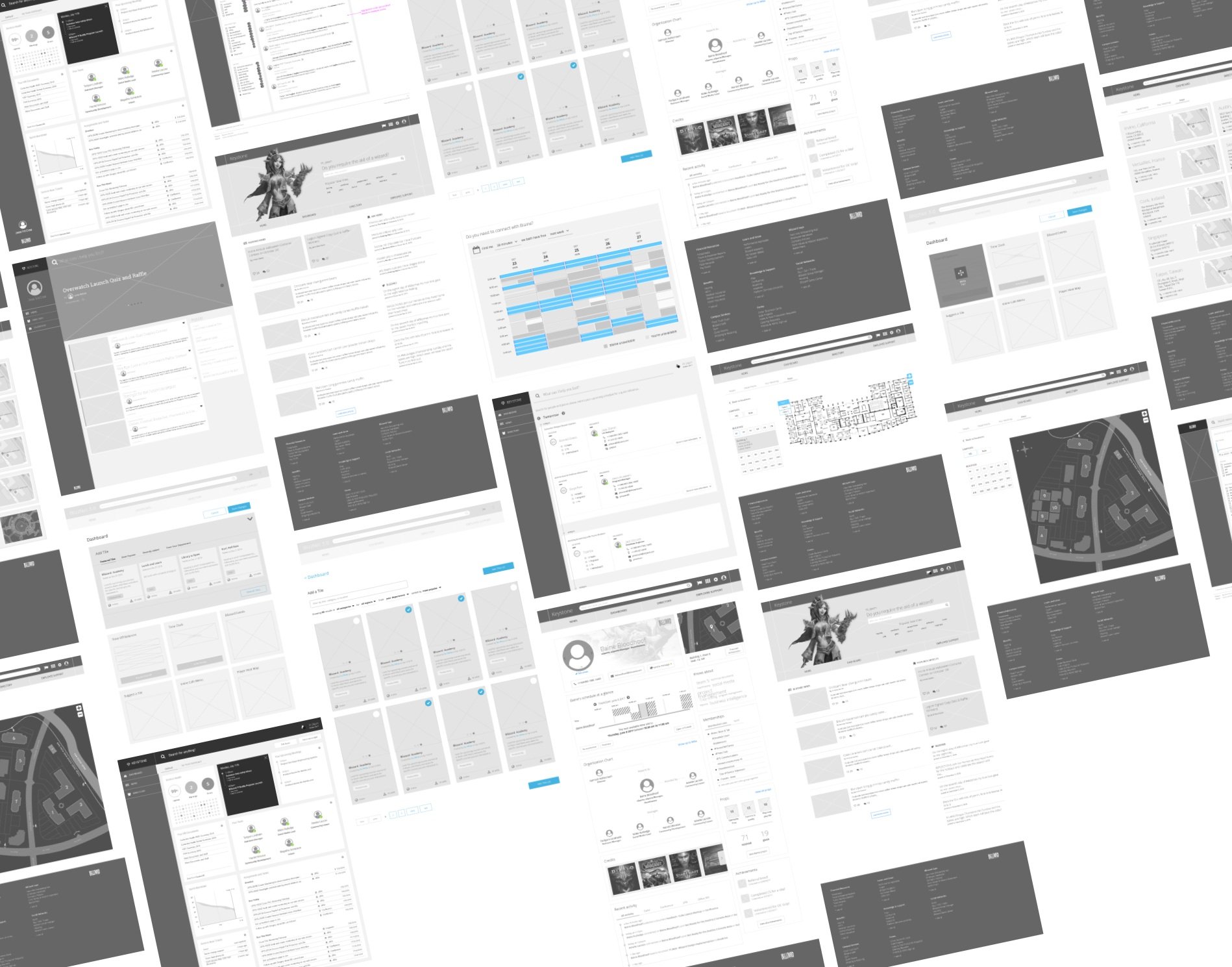
From rough pencil sketches to interactive prototypes, the design team created hundreds of assets to capture dozens of workflows. Low-fidelity outputs allowed us to quickly test and validate ideas. High-fidelity wires and prototypes allowed us to proceed with more confidence and serve as documentation. Throughout the entire process, engineers, PMs, and stakeholders were close partners and frequent collaborators.

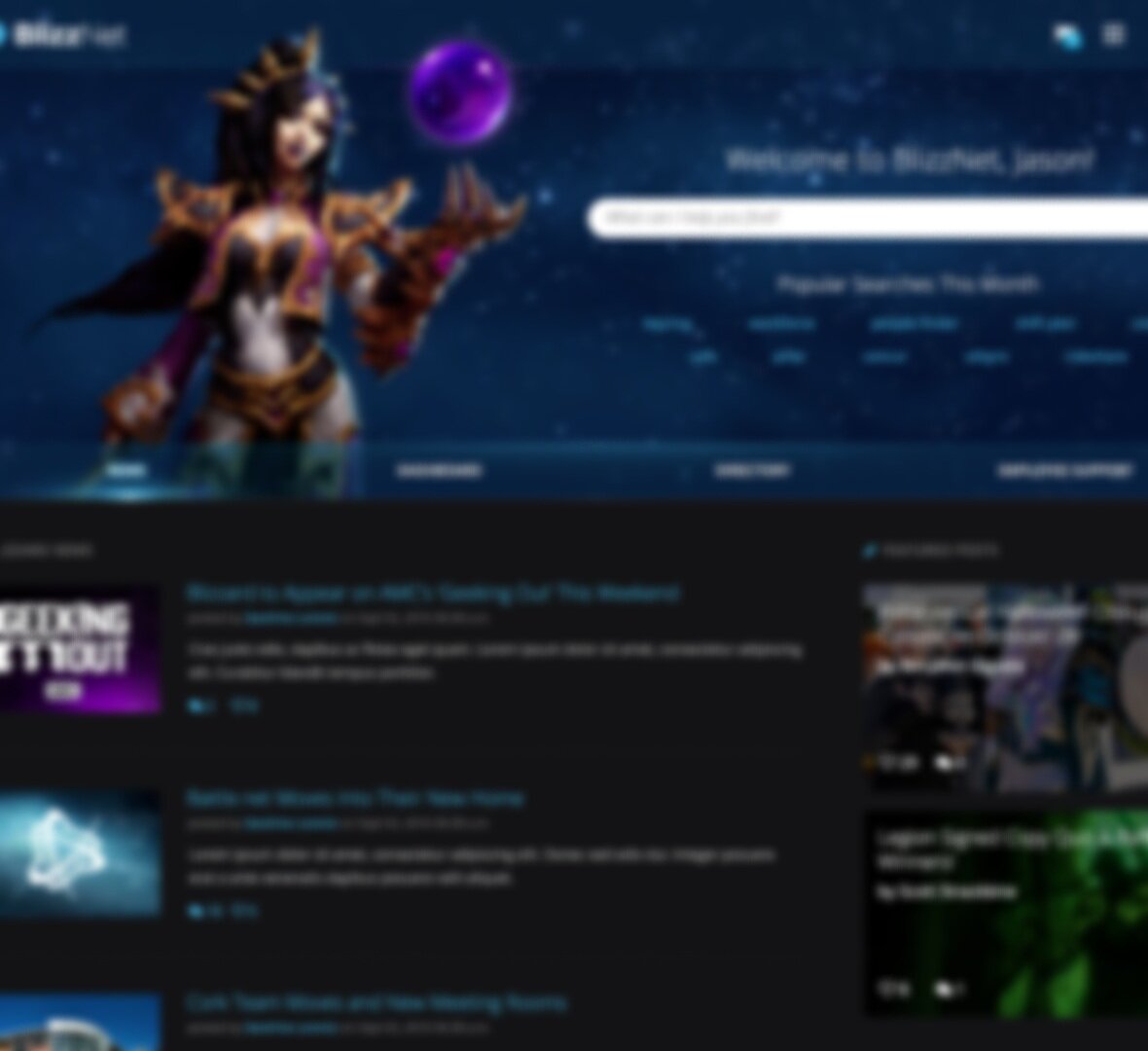
The Blizzard polish
Internally, the Blizzard polish refers to going that extra mile that really makes a product shine. Our characters and worlds are a deep part of our DNA, so we wanted to make sure we embraced those elements in the design.
We reached out to our game teams to showcase key-art throughout the site, and worked with copy writers and lore specialists to establish a unique tone in the copy.
Where we succeeded
01
Created a custom portal with hooks into various data sources, federating search and unifying the most common data entities under one location.
02
Recommended results resolved the most common search queries over 82% of the time. An auto-complete search feature also aided users in getting to the right results.
03
Reduced pogo-sticking on the news river by 20% in the first week.
04
We replaced the mega-menu with a quick-menu shortcut with a 77% adoption rate (created at least three shortcuts). Half the users created five or more links.
05
Added responsive breakpoints (many IT/engineering users keep their monitors in portrait mode).
06
Boosted performance - sub 3-second load times in regional offices.

Actual email sent to the product team by Jay Allen Brack, then Executive Producer of Word of Warcraft, and former President of Blizzard Entertainment. Feelsgoodman.jpg.
Lessons learned
01
Entirely removing the mega-menu was too radical, despite what we observed and what users said. “Discovery” as an intranet experience went away and was sorely missed.
02
Over-promised and under-delivered on the search experience. We are not Google. While we regularly resolved common search queries successfully, we did not provide a good experience to users who used vague terms, typos or natural language.
03
In order to even maintain a good experience on common search queries, the core product team had to keep tuning the search engine to keep results current and relevant, resulting in unexpected overhead for our team.
04
We did not launch with as many dashboard widgets as we had hoped for, and did not prioritize requests for dashboard widgets from the community.
Value delivered
Federated Search
A federated search engine allowed users to get results from their query across multiple data sources. A “best bet” engine also highlighted a recommended result based on the user’s keywords.
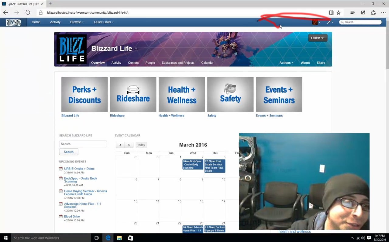
Employee dashboard
A customizable dashboard allowed employees to accomplish a variety of common tasks without having to open multiple tools - like clocking in and out, request PTO, view company events, and check the cafe menu.
Improved directory services
Our directory improved to include helpful information about employees and conference rooms. We introduced new features like “presence” to let users know when and where things are available.
Region sensitive news
As a global company, not everyone needed to see the same news river. Employees were defaulted to news from their own region, but opt-in features also allowed them to see additional content as well.