Case Study
Blizzard Campus Experience
Vision: Showcase the campus and highlight Blizzard as a first-rate technology company
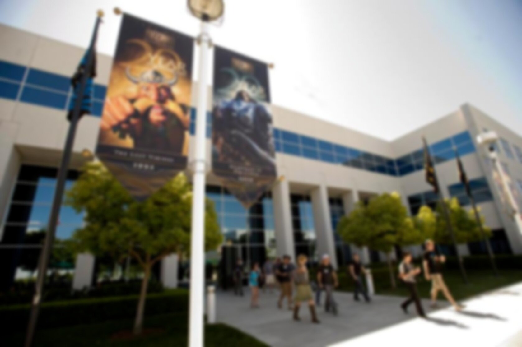
Blizzard’s main campus in Irvine, California welcomes over 12,000 visitors every year. It is home to dozens of character statues, a museum, a library, Starbucks, and some of the biggest names in gaming.
Guests - including applicants, partners and celebrities - are often treated to a tour of the campus upon arrival. From a business perspective, leaders in the company wanted the campus to be part of the recruitment strategy. Altogether, we knew the visitor experience had to be memorable.
Corp Apps was challenged to modernize the visitor experience in a way that showed off our creativity as well as our technical prowess. We were asked to do it within a few months prior to the start of BlizzCon - our annual convention - where traffic to the campus dramatically increases.
The Problem
-

The first stop on a Blizzard tour is typically at reception, where guests check-in. The space isn’t small, but tour groups can be as large as 30 people. This can create a lot of bottleneck at reception as guests are processed one or two at a time.
-

There is a lot of story to be told at Blizzard, but that story is often best delivered by a trained tour specialist. As such, employees who bring applicants, vendors, or even family to campus are not always knowledgeable in everything the campus has to offer.
-

The Irvine campus is Blizzard’s main headquarters. Points of interest are scattered across 26 buildings which span multiple city blocks. Moreover, items like statues move often, so even employees get confused!
The research
In order to improve the visitor experience, we needed a first-hand understanding of the experience itself. A few members of our team, including myself, arranged to join a public tour. Using our personal email addresses, we hit all the touchpoints that an external user would interact with - signing up via the company website, received a confirmation email, and showed up at the main security gate on the morning of our “visit.”
Not only did we participate in the campus tour, but we also interviewed receptionists, security guards, Public Relations, and employees. The design team put together all our notes in a staging area, and a picture of a new visitor experience started to come together.

01.
OBSERVATION | Guests are registered by using an internal tool, from which a list of names is made for Security before the day of visit.
OPPORTUNITY | Automate this.
02.
OBSERVATION | Guests receive an email confirmation with maps, driving directions, and parking instructions as PDF attachments.
OPPORTUNITY | Improve the email by putting all relevant information into the body, and leverage mapping tools.
03.
OBSERVATION | Checking in means signing an NDA, and an ID badge is printed out while the host (if applicable) is notified.
OPPORTUNITY | Streamline this process. Are there any steps that can be done prior to arrival at the front desk?
04.
OBSERVATION | Most visitors are already fans of Blizzard, but minors do come with parents or guardians who might not be as familiar.
OPPORTUNITY | Make the tour a good experience for everyone, including the uninitiated. Create new fans!
05.
OBSERVATION | For the most part, the tour is a very one-dimensional experience. No touching!
OPPORTUNITY | Make it more tactile; engage more of the senses.
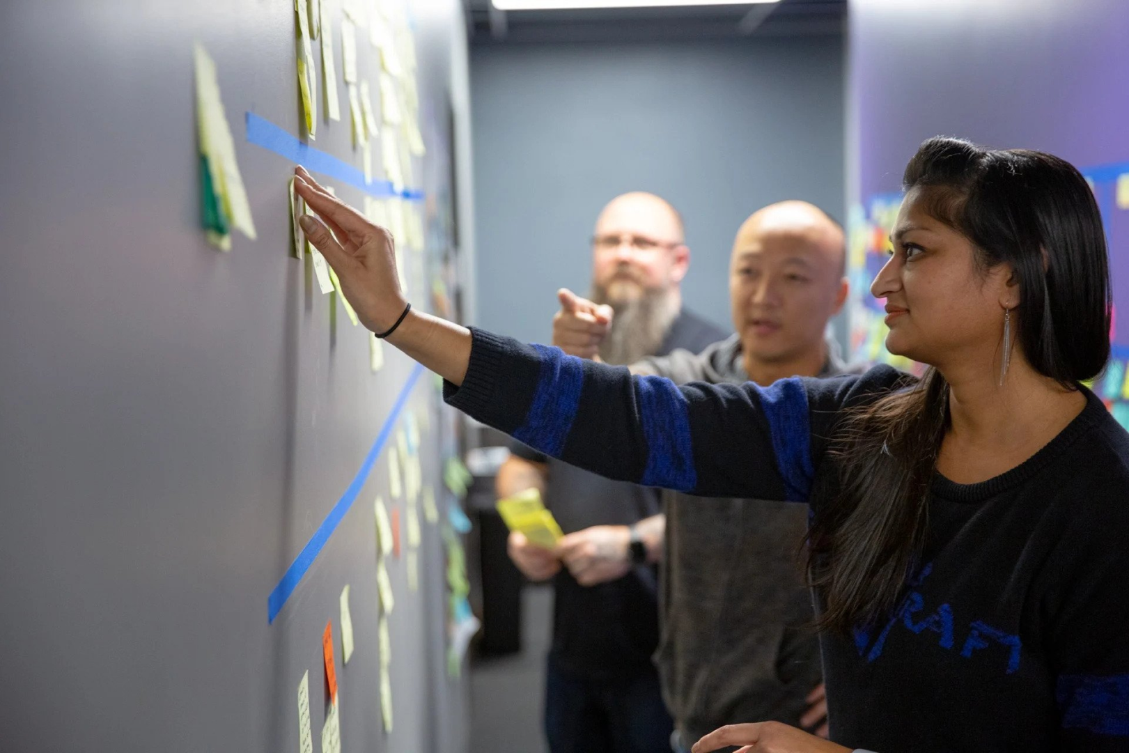
Notes are consolidated and opportunities for improvement are documented. To make sure we delivered on time, it was important for us to distinguish between blue sky ideas and efforts that could be realistically achieved.
The registration makeover
Work it out with workflows

After our research, my colleague devised a new workflow that considered types of visitors, employees, and security needs. We thought guest registration was a pretty straightforward process. We were wrong!
Partnership with Envoy
Envoy - a leader in visitor check-in solutions - leveled up the first major touchpoint in the campus experience. Leaning on a turnkey solution also freed up our engineering efforts to focus on other areas.
My role in this part of the process was UX researcher and consultant. Our visual design team came up with a Blizzard theme for the emails and kiosk screens.
Based on our recommendations, the Envoy solution was able to:
-

Generate mobile-friendly emails to visitors and provide relevant info in the body instead of attachments.
-

Allow visitors to pre-register and sign the NDA prior to arrival, dramatically speeding-up the check-in process. Especially large groups!
-

Let visitors self check-in using mounted kiosks in our lobby, further freeing up reception. Kiosks also had the added benefit of allowing guests to check-in at other buildings.
The Interactive Lobby Display
No moment wasted
In order to modernize and delight, we wanted to make a great first impression within the first few minutes of anyone stepping on campus. Even with a faster check-in process, large groups can easily spend 15 to 20 minutes in the lobby waiting for each individual to complete registration. Instead why not give guests something to do?
Our idea was a 50” interactive display that would showcase Blizzard history, core values, culture, and a map of various points of interest. I designed the mapping experience and provided UX oversight on the other areas, and it is still used in the Blizzard lobby today.
Design. Test. Repeat.
We had a ton of ideas on what to do with an interactive screen, but didn’t have a lot of time to validate them with real guests. So, after setting a few rough ideas to wires, we turned to our fellow employees. We set up guerilla test sessions using prototypes in the courtyard, and stuck to the magic number - 5 users - to get quick feedback and temperature checks.
Rinse, repeat.

“When you don’t have a lot of time to develop a product, you should just skip user testing.”
— No (successful) product designer ever
-

The Hook
This was the default screen of the 50” interactive display. This screen needed to compete with all the activity that happens in the lobby, so we knew it had to call attention to itself.
-

The Campus Map
This interactive map supports full touch controls. Users could zoom in and out of the map, and tapping on a POI brings up more information. Even employees found this a helpful addition to the campus!
-

The Core Values
Blizzard’s core values inform everything it does, so much so that the eight core values become a part of the employee’s vernacular. It was important to share those values with the public.
-

The Games
Of course, it’s the games that matter at the end of the day. Blizzard’s rich history of successes are shown off with game art, team photos, and more!
The Interactive Lobby Display
“That’s cool… what is it?”
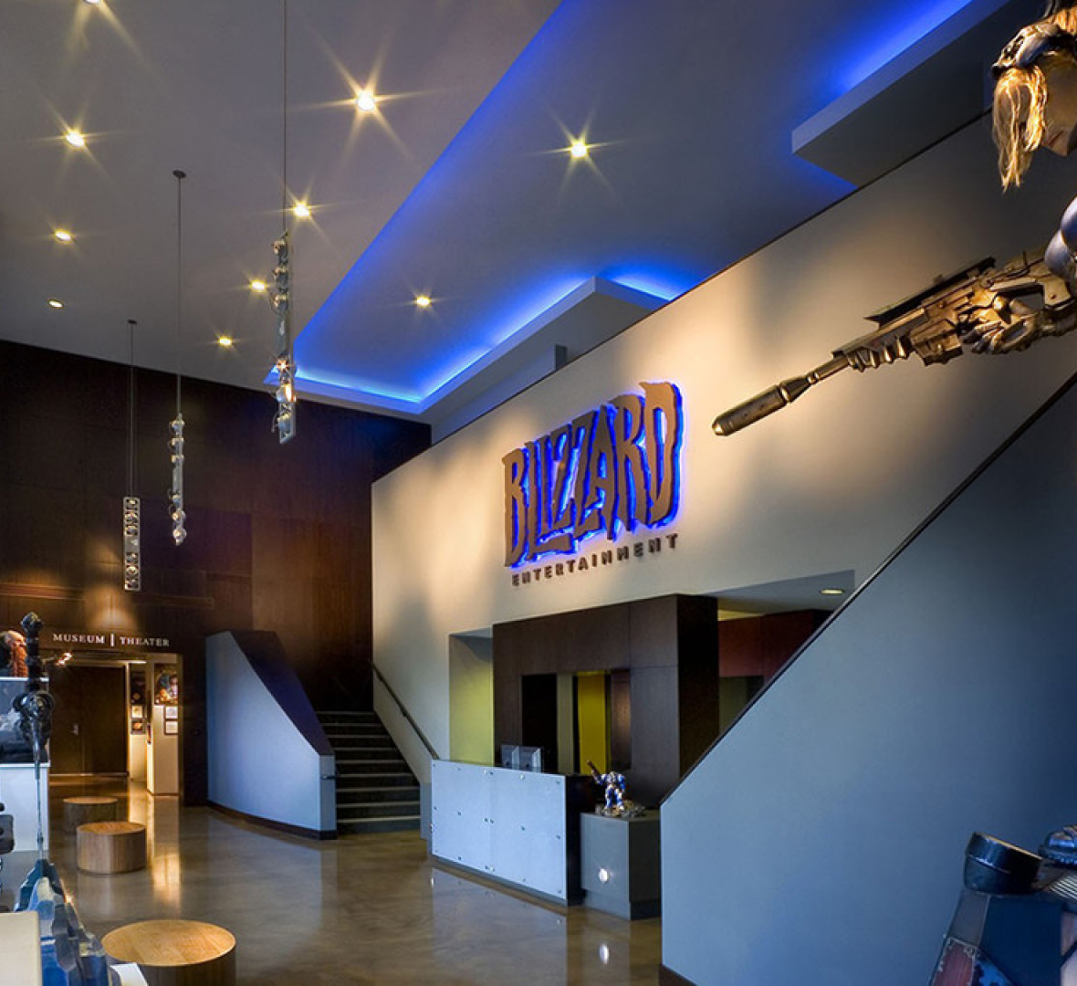
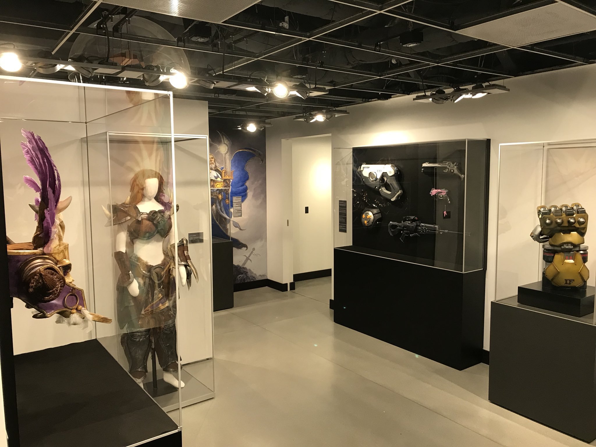
The Blizzard museum is only steps away from the lobby entrance. In addition to evergreen items like company awards and exclusive employee swag, a new exhibit rotates in every six to nine months.
Our upgrades to the campus experience happened to align with the start of a new exhibit called “The Armory,” which showed off props, weapons, armor, outfits, and magical items from our games.
From a fan’s perspective, after you “ooo and ahh” what’s behind the glass, it’s still a one-dimensional experience. You can look, but don’t touch! And if you’re not a fan, you might not even know what you’re looking at!
An interactive display in the museum would augment the entire experience. Fans get a little more of what they came for, and casual guests get bite-sized facts. I was the primary UX designer on this product, and this exhibit ran from 2018 into early 2019. The display can still be accessed today from an internal URL.

From concept…
We didn’t want a guest to “figure out” how to use this display, so it had to be dead simple right from the onset. Testing the interactions with low fidelity gave us the data and confidence to move forward.
…to execution.
Once the experience was production-ready, we ran additional tests in the museum to harden our findings and make final tweaks.
-

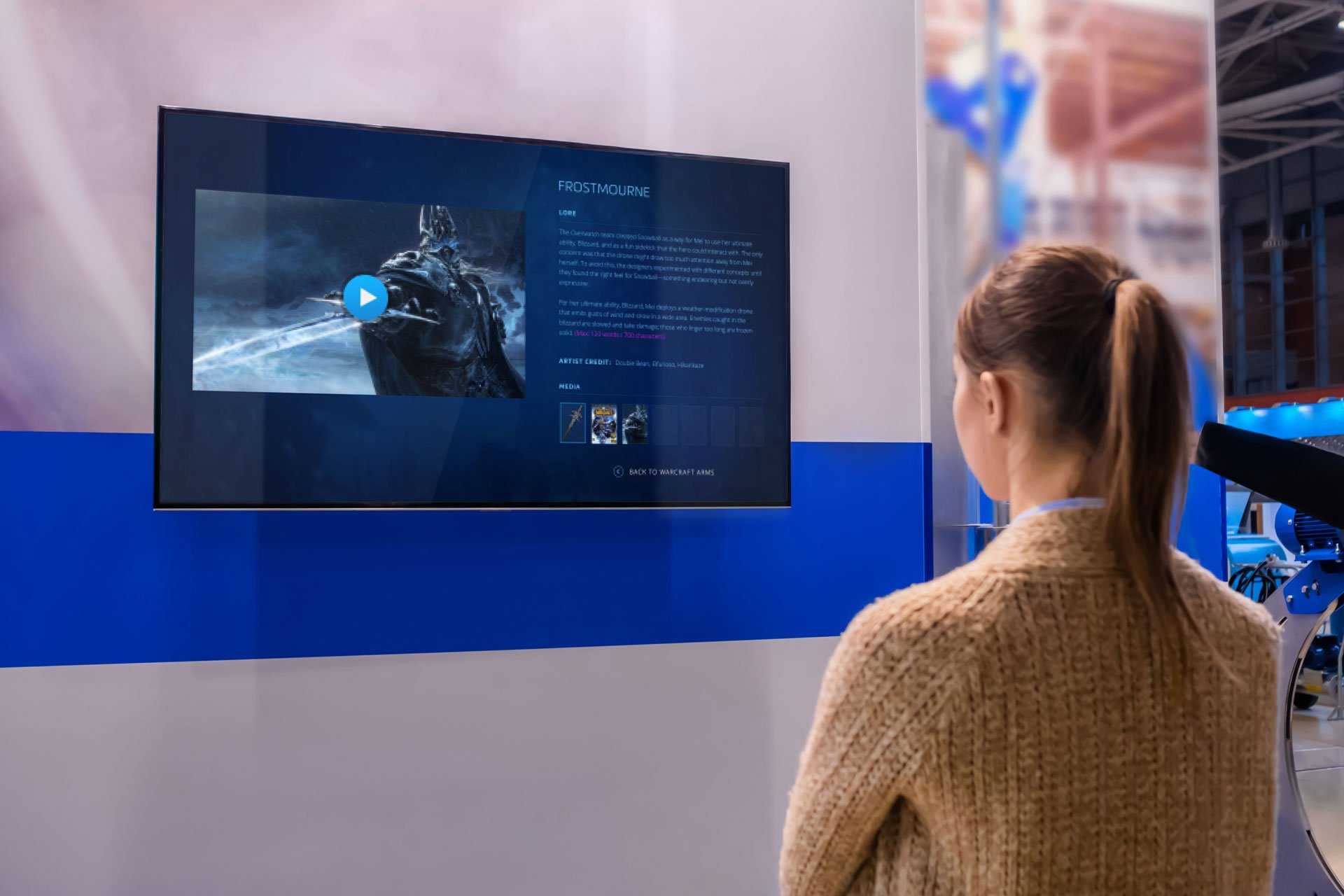
The museum display was a relatively simple 3-screen template that started with this landing page. A looping cinematic from each franchise played behind the logo, giving the display a bit of energy to grab the user’s attention. The display would also return to this screen if there was no user activity after a while.
-

Selecting a franchise takes the user to a collections page that showed all related items on display in the museum. We worked with our vault team to obtain in-game shots of objects in ultra-high resolution.
-

Finally, the item is shown off with a slider that the user could move to compare its in-game shot with the real-life object. Descriptions of both the game item and the real object were provided by our Story and Franchise team. The user could also see additional media related to this item, including cinematics.
Lessons Learned
01.
It was the first time I had designed a digital product to work within a physical space, and I didn’t fully understand how a user would navigate between the real world and a digital display. For example, the museum display was mounted in an area that did not have line-of-sight to many exhibit pieces.
02.
We failed to consider ADA compliance right at the outset, and had to scramble to find new solutions as these requirements were brought to light. For example, the highest touchpoint on an interactive display must be no more than 48” off the ground.
03.
As an international business, we get a lot of international visitors for whom English is not their first language. The entirety of the digital experience, including the NDA in the registration process (!), was only in English. Supporting other languages was backlogged shortly after launch.
04.
Only one person was able to interact with a display at a time, leaving others as passive observers. Our goal was to make the campus experience more tactile, but we were only able to do so for smaller parties or individuals.
“The interactive display was such a nice addition to the exhibit... everyone seemed to love it.”
— Dana Bishop, Blizzard Museum Curator